top of page

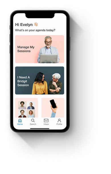
An app focused on enhancing digital literacy among senior users.
DURATION
8 weeks
ROLE
UX Researcher
UX/UI Designer
DEVICE
iOS
INTRODUCTION
Raise a hand if you've ever guided an older family or friend through the intricacies of their digital device. You patiently show them the ropes, but not long after, the same or new questions arise. Sound familiar?
Older users often perceive technology less intuitively than their younger counterparts. Digital interfaces pose challenges, contributing to an expanding digital knowledge gap as technology advances.
THE DESIGN THINKING METHOD
To address this challenge, I adopted the Design Thinking Method. This human-centric approach not only sparked creative ideas, but also anchored my process. It ensured that the solution would be attuned to the unique challenges faced by older individuals in the digital space.
EMPATHIZE
PROBLEM SPACE
Smartphone ownership among those aged 65 and older has significantly increased from 13% in 2012 to 61% in 2021. Although a growing number of individuals aged 65 and older own smartphones, a substantial portion encounter difficulties in utilizing them effectively.

In conducting this research study, I hoped to...
01.
Gain insights into the factors that either encourage, or discourage, adoption of new technology among elders.
02.
Investigate the motivations behind why older adults choose to engage with technology.
03.
Uncover common challenges and frustrations among elders when interacting with new, or existing, technologies.
DEFINE
HOW MIGHT WE ...
improve communication and information accessibility for older individuals interacting with technology so they can utilize their devices more effectively?
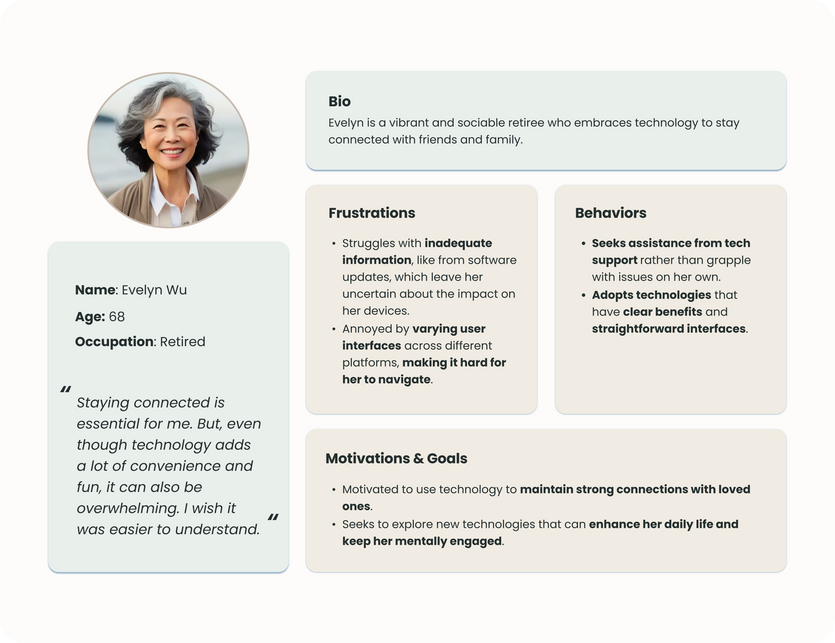
MEET EVELYN
EVELYN'S EXPERIENCE MAP

PRODUCT FUNCTIONALITY
With a persona and experience map in hand, I created a list of user stories to identify product functionality. These users stories were then grouped into thematically, or functionally-related Epics, which provided me with a high-level overview of the product, overall structure, and focus areas of my design.
CHOSEN EPIC & USER STORIES
The persona, Evelyn, actively uses digital devices, but sometimes struggles with utilizing them effectively. The “Booking A Session” epic aligns with Evelyn’s needs by providing her with the opportunity to learn from a dedicated mentor.
01.
As an Elder Tech Learner, I want to have flexible session scheduling so that I can choose a time that works best with my schedule.
02.
As an Elder Tech Learner, I want to speak with a mentor in a way that is tailored to my needs, so that I can have an optimal experience.
03.
As an Elder Tech Learner, I want to share my device challenges so that my match can understand my learning goals.
04.
As an Elder Tech Learner, I want to be able to see key information about my matched mentor, so that I can feel confident in their ability to help me.
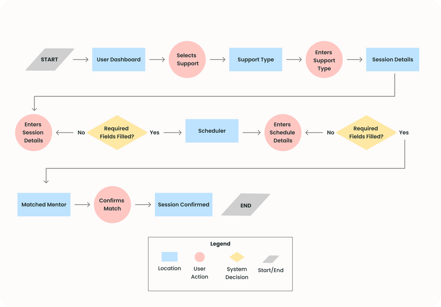
TASK FLOW: BOOK A SESSION
IDEATE
INSPIRATION
With task flow in-hand, I began the next phase of the design thinking process - ideation. I drew inspiration from various UI elements to inform my app's interface.

Next, I transformed concepts into tangible (exploratory) sketches informed by my UI inspiration.

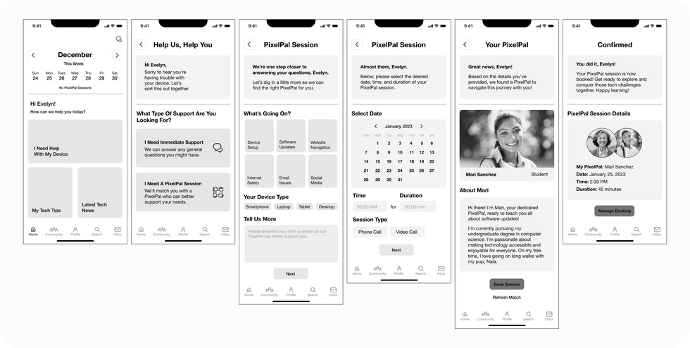
I then translated my chosen sketches into greyscale wireframes.
See Comments 👆🏼
PROTOTYPE & TEST
USER TESTING
With finalized greyscale wireframes, I proceeded to prototype my designs and prepared for Round 1 user testing.
ROUND ONE RESULTS
I learned that at least 2 out of 5 tasks created obstacles for my users. I analyzed their feedback and defined usability issues and placed the issues on a design prioritization matrix to determine which were the most realistic to address relative to user value and level of effort.

After the 1st round of user testing, I implemented the changes into my designs and prepared for a 2nd round of user testing. This ensured that my design changes actually created positive change, while also allowing me an additional opportunity for further improvements.
ROUND TWO RESULTS
For my second round of user testing, all users were able to successfully complete the task of Booking a Session. Despite a 100% success rate, there were still opportunities for improved usability. I placed the issues on a design prioritization matrix to determine which were the most realistic to address relative to user value and level of effort.

After implementing Round 2 feedback, I arrived at my finalized greyscale wireframes. This concluded the Prototype and Test stage and I was ready to move on to brand development.

BRAND DEVELOPMENT
With a validated prototype, I was ready to establish the brand identity. I created a moodboard to identify the most prominent colors that aligned with the brand's tone - comfort, warmth, simplicity, collaboration, steadiness.

BRAND COLORS
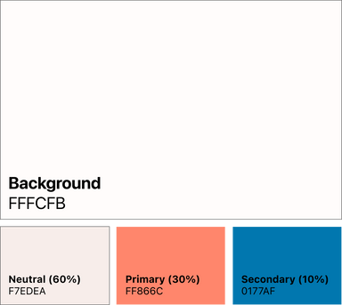
After narrowing my color options to 4 pairs, I chose the colors that best conveyed comfort, warmth, simplicity, collaboration, and steadiness.
The neutral (60%) gave the interface a sense of warmth and comfort. The primary color (30%) was used in icons and card states to provide a sense of vibrancy necessary for collaboration. And finally, the secondary color (10%) used in CTAs evoked steadiness in every action.
MOBILE APP DESIGN
With my chosen brand colors, I began mobile app designs. I searched for UI inspiration to help me determine how to use imagery, colors, and icons.
BRAND NAME
To stay on-brand, my names needed to convey inclusivity, support, connection, engagement, learning, and expertise. So, I comprised a list of 12 possibilities. These names laddered up to my chosen adjectives and provided necessary constraints when I began this exercise.
Pixelpals
Clicky
Techwise
Keypals
Peerly
HeyPixel
Device Buddy
Seniority
Learnable
Bridgit
Teachable
Savvy
THE NAME
BRIDGIT
The combination of "bridge" and "it" created a clear metaphor for the underlying purpose of the app - bridging the learning gap between elders and technology. Equally important, the brand name is comfortable, warm, simple, collaborative, and grounded which ties back to my chosen adjectives.
WORDMARK
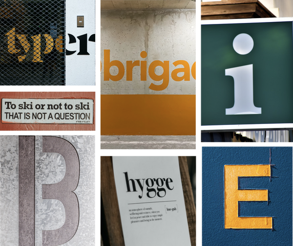
Now that I had my brand name, I needed to determine a distinct text-only typographic treatment of my app’s name “Bridgit.” So, I started by creating a typographical moodboard.
WORDMARK SKETCHES
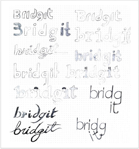
Using my typography inspiration, I sketched numerous wordmarks to determine the type treatment.
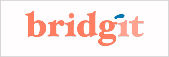
I ultimately landed on the Hoefler Text because its sophisticated and refined serifs convey a sense of comfort, aligning with the app's warm and welcoming tone. The font's elegant and traditional appearance also adds a touch of simplicity and steadiness.

MOBILE APP ICON
With a finalized wordmark, it was time to develop an app icon version for Apple’s App Store. Again, I started by sketching out various designs.
I chose the simple letter “b” with the bridge over it’s rounded curve to ensure consistency with my wordmark treatment. I then aligned my mobile app icon colors with my wordmark to maintain the brand's visual identity.


See Comments
UI LIBRARY
To conclude the UI stage, I compiled my UI library which accounted for typography, color, grids, and accessibility.
See Comments
The Atomic Design System was my guiding framework for organizing and structuring design elements. I ensured consistency and reusability by breaking down UI components into atoms, molecules, organisms, templates, and pages.

FINAL DESIGNS
INTERACT WITH PROTOTYPE
MULTI-PLATFORM DESIGN
Among 1,500 US adults surveyed, 44% of those 65+ owned a tablet which makes the iPad a realistic platform to also consider for my users. Further, the iPad is a platform favored for its accessibility, simplicity, and portability.
User Dashboard
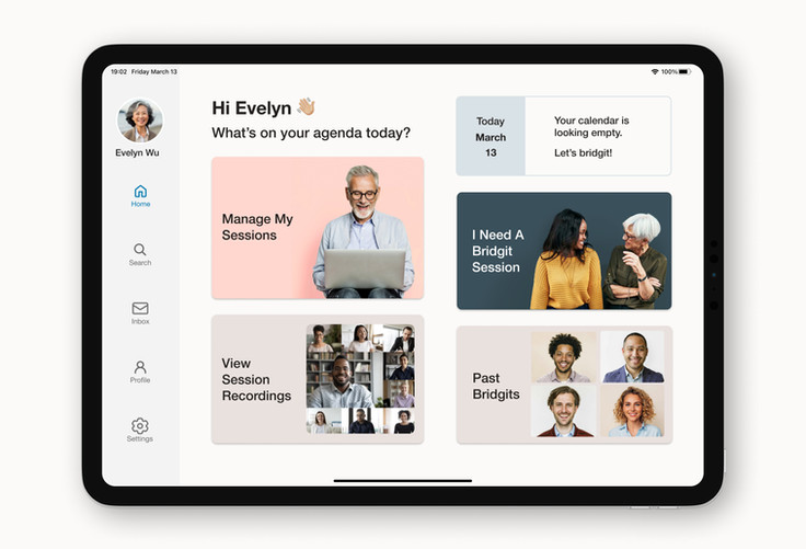
To explore what an iPad interface could look like, I repurposed my original task flow. This is because the starting point for Booking A Session always begins at the user's dashboard. Given the additional real estate, what content should be displayed?
The mockup features a sidebar navigation commonly seen on iPadOS 14 and above. I also included an additional card to View Session Recordings right from their dashboard for greater convenience. And finally, I included a calendar widget which quickly informs my user of an upcoming booking.
DESIGN IMPACT &
FUTURE THINKING
The Design Impact
As technology advances, elder users are especially vulnerable of being left behind.
Mass scale usage of Bridgit could offer a transformative shift in which seniors are empowered to not only adapt to the digital landscape, but also thrive in it.
Together, we have the potential to redefine the narrative around aging and technology and offer a more connected and inclusive society unburdened by generational barriers.
Key Learnings
Good UX is a continuous cycle of empathy, iteration, and refinement.
I learned so much about my target audience and invalidated most of my assumptions about the problem by simply listening to their story. This allowed me to design a solution with my target users at the center.
Meet people where they are.
Elder users desire simple and minimal layouts for best user experience. Copy and tone are critical to ensure elder users feel heard and understood, but they do not want to feel patronized in their lack of understanding. Balance encouragement and maturity with intention.
Next Steps
Design for edge cases.
If a user made a mistake when booking their session, how might I implement a feature that would allow them to easily edit or reschedule their session? Accounting for this ensures that my product remains usable in various circumstances.
Revisit and expand user stories.
Diversify and expand task flows to cover a broader range of user interactions within the Bridgit app.
bottom of page


